User-centered design: complex information structures at FPS Mobility and Transport
The Federal Public Service (FPS) Mobility and Transport are responsible for overseeing various aspects of transportation and mobility at the federal level in Belgium. Its website features information on the most varied topics with regards to mobility and transportation. Departments feature responsibilities on aviation, roads, maritime, railways and sustainable mobility. The organisation is a part of the Belgian federal administration and operates under the Ministry of Mobility.
The goal
The goal was a completely new UX/UI design and content structure for the new website for FPS Mobility and Transport. The new design for the website needed to be flexible enough for future changes and provide sufficient coherence between the different departments within FPS Mobility and Transport.
The broad target group and diverse domains (aviation, shipping, road traffic and rail transport) made it a major challenge to design a structure that meets the diverse needs of the various end users.
What we did
Our approach
Using the user-centered design methodology, we worked closely with both internal domain experts and varied groups of users from the very start of the project. Through interviews, card-sorting sessions and structure tests, we were able to structure the large amount of content and topics that are bundled on the FPS Mobility and Transport website in a way that matched the expectations of the different users.

Card sorting workshop to discover and improve the complex information architecture.
The website’s complexity was tackled by using a task-oriented structure within which the information is offered in a step-by-step manner. By using clear navigation levels, we avoided overwhelming the user with information. Moreover, this allowed the same content page to help both the sporadic visitor and the professional, frequent visitor. By including an overview of “Quick to” topics at all levels in the structure, frequently used elements were made easily accessible in a flexible way without having to adapt the general site structure.

User-centered design of the FPS Mobility and Transport homepage for desktop devices.
Accessibility requirements were taken into account from the start of the design phase. This includes combining visuals and textual explanations, limiting the use of hoovering and respecting contrast values. Next to the new designs, recommendations for the development of the website (technical specifications) and the content in accordance with the WCAG2.1 guidelines were delivered. To achieve this, we used a checklist in accordance with the WCAG2.1 guidelines (and EN 301 549).
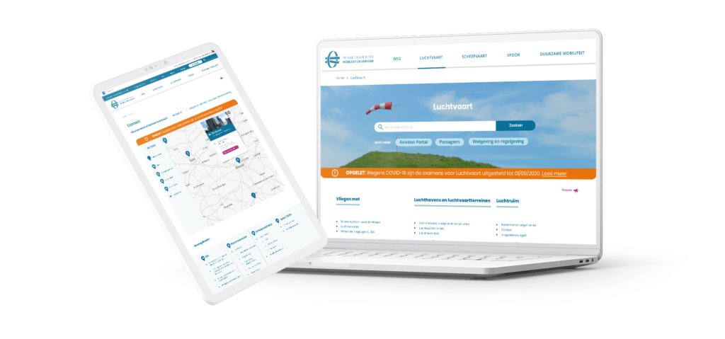
Web designs on desktop and mobile, taking into account the complex information structure.
The results
Users often are not aware what FPS Mobility and Transport department is responsible for offering certain information. Even if they are, users experienced difficulties to actually find the correct information they are looking for. Therefore, a guided and contextual contact flow was designed. Answers on all kinds of questions were provided via roadmaps, independent of political & internal responsibilities. That way, clarity was created about the departments’ responsibilities and users were correctly referred to the right source of information.
Visitors always expect to find up-to-date & correct content. A government website should be a single source of truth. During this project, the right balance was sought between language that was legally correct and also understandable to all different Belgian citizens.
The audience of the FPS Mobility and Transport website is very diverse. That is why a clear distinction was made on the content pages between basic information, accessible and understandable for any user, and more specialized information intended for professional profiles.