Saving lives with 112.be
112 is your life-saving number in whole Europe, it is free of charge and the operators are well trained to give assistance in every situation of distress and dispatch the needed help to your location.
Each country in EU is responsible for informing their citizens about this emergency number.
The federal Public Service for Internal Affairs contacted us to help them revision the Belgian 112 website.
The goal
Our goal was to design a brand-new and mobile-friendly website that is aligned with both the business and user needs. This means a website that answers any question a visitor may have as quickly and clearly as possible. Another important goal was to promote the 112 mobile app because it brings many benefits both to users and to the emergency services.
What we did
Our approach
In the first step we did a full review of the website, adding post it notes to each block of content explaining the purpose and getting a clear overview of how the current site is structured and which information is provided to their users.
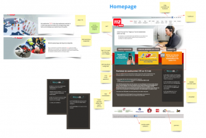
Figure 1: Workshop to analyse the existing website.
Armed with this knowledge we set up a first workshop with the business to co-create on the key messages of the new website and to align the goals of the emergency services and the users.
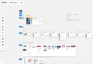
Figure 2: Workshop in Miro to align business goals and user needs.
In the next step, we dived in the analytics and the Hotjar survey that we set up at the start of the project.
We asked the visitors a couple of questions:
- Why are you visiting the website
- What is your profile? (person in need/medical service team member/teacher….)
- Did you find what you are looking for?
Both the analytics and Hotjar confirmed our insights from the workshops that the two main things users were looking for were:
- Who to call and how to call them
- How to get the mobile app
But we also noticed the website attracted many other visitors: teachers looking for materials to teach kids, deaf and hearing impaired looking for ways to contact 112, members of the emergency centers looking for promotion materials…
A key take-away from this case was that while the mobile app was one of the most sought after features however it was barely downloaded. This was mainly due to the call to actions to being buried beneath informative videos about the app.
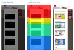
Figure 3: Heatmap analysis in Hotjar.
In the next steps we took our learnings from the workshop and analytics and provided a first draft wireframe to validate if we covered all the necessary needs.
After validation of the wireframes we converted them in final visual designs ready for development. Both on desktop but also on mobile.
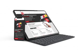
Figure 4: Wireframes with the final result.
The results
What the client said
The Directorate-General Civil Security has asked Humix to help with the service design of the future website 112.be so that we can also take the utmost account of the feedback and needs of the people who will visit the website. The new website had to be fully adapted to smartphone use, Drupal technology and the specific needs of the Directorate 112. After several meetings with an internal working group, we are more than satisfied with the structure that was provided in order to create the new website.
Thomas Biebauw – communication officer FOD IBZ
