Dashboarding the European automotive supply sector
CLEPA is the voice of European automotive suppliers. They represent over 3.000 companies, which employ 5.000.000 employees. By conducting extensive research, CLEPA helps shaping the decision-making process of EU institutions and UN authorities to achieve safe, smart and sustainable mobility. With plenty of different studies and data to communicate, we were excited to help visualize CLEPA’s insights into dynamic data dashboards.
The goal
The goal of this project was to communicate CLEPA’s story and corresponding research data in a clear and visual way to their audiences. From policy makers to internal CLEPA members, the different scenarios and figures on the employment impact of transitions in the automotive sector should be understandable when looking at the dashboards. Additionally, another objective was to make the data in the dashboards dynamic and interactive, with the opportunity to see both positive and negative scenarios.
What we did
Our approach
At the start of the project, we received a wide variety of data and information to familiarize with the topic and goals of CLEPA. To structure this information and make sure we were on the same page, we did a workshop to align business and user needs for the dashboards. Questions that were answered during this session included:
- Who are the consumers of the data?
- What insights are the users expect to get from the data?
- When are the data visualizations a success?
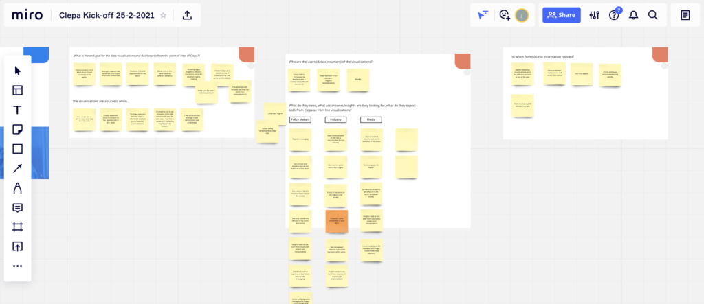
Workshop to analyse the needs and goals of the project.
The input of this alignment meeting provided the information we needed to kick-off the project. We got the ball rolling by creating the first design proposals for the dashboards, while also analyzing and cleaning the data to connect it to Google Data Studio (the tool we used to create the dashboards). Pairing a designer and data analyst to work in parallel, really elevated the dashboards from the very start. We soon had a ‘prototype’ in Data Studio to share that we could further develop.
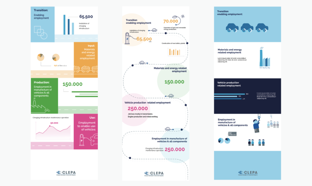
Early design proposals to determine visual look & feel of the dashboards.
The first proposed designs were based on analysis of the CLEPA website, documents we received previously and the input from the workshop. Each design featured a different presentation and visual style. After some feedback, we were able to determine the dashboards’ look & feel. A combination of graphical elements was discussed, with a focus on storytelling to guide the user through the data and the message it supports.
Next to the designs was the processing of the data. From the start of the project, the goal was to establish a dynamic data setup that allows CLEPA to simply adjust or add any data to the dashboards. As we were working with research data and studies, the most solid way to connect to Data Studio was by using Google Sheets. We made sure every tab is built as a template to easily update any data or scenarios. Updating data in Google Sheets = data available in the Data Studio dashboards. This makes showing the latest data in the dashboards easy to maintain. In addition, we applied interactions and filters to certain graphs in the dashboard, so users can engage and dig deeper into the data.
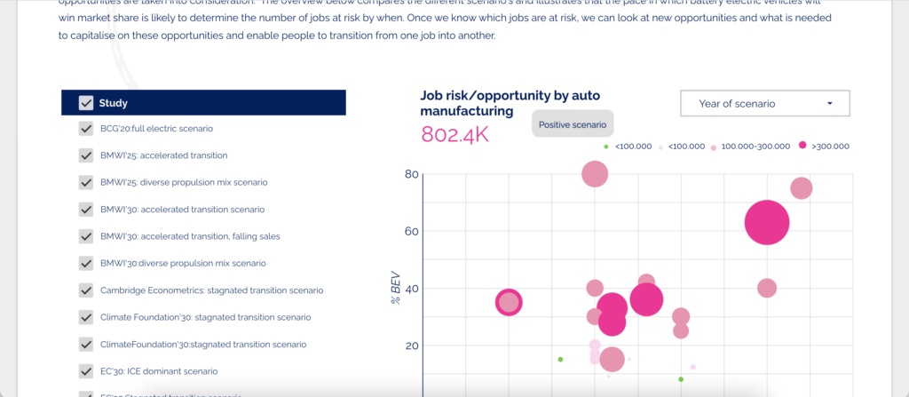
Impact of different research scenarios on job risks/opportunities in the auto manufacturing sector, visualized in Google Data Studio.
After weekly feedback sessions with CLEPA, we reached the end of the assembly line. Together we watched our dashboard develop from a rather simple data overview of the impact on production employment, to an interactive multi-page dashboard that highlights various aspects of the transitions in the automotive supply sector. By using graphical elements as a canvas to present data upon, we achieved a visually attractive data dashboard that allows to update and display data dynamically. It helped to make CLEPA’s research data insightful and visualize their story about the employment impact in the automotive sector in a new and interactive way.
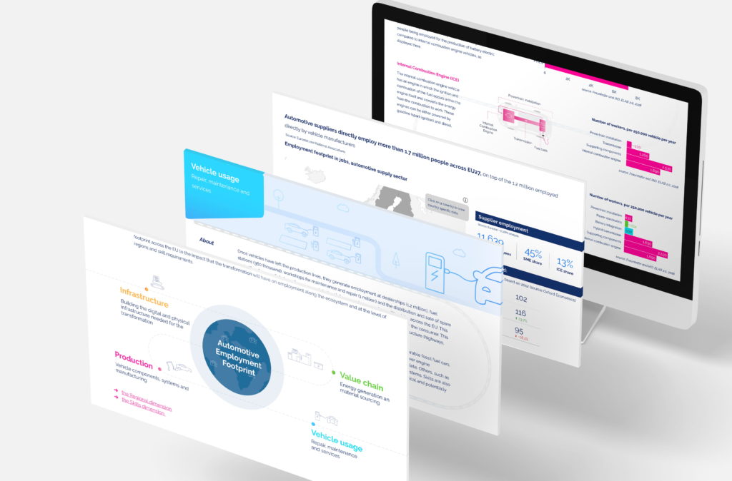
Results of the dashboards in Google Data Studio.
The results
What the client said
The Humix team is a great combination of talented data analyst, visual designers and project managers. They helped us to better define the main objectives of our project and found the right tools to create a dashboard that is able to display complex data in an interactive, clear and simple way. They delivered the foundation of a project that can be further expanded without the need of high IT skills, but we will not hesitate to involve them again for the upcoming updates on the tool.