Have you ever noticed that time seems to fly when you’re engrossed in a task? Or that it drags on endlessly when you’re bored or uninterested? As designers, we can use our knowledge of the time paradox to create user experiences that feel shorter and more engaging.
Make Time Fly with UX Design

What is the Time Paradox?
The time paradox is the idea that our perception of time is relative to the mental processing required to complete a task. When we’re engaged in a task that requires a lot of mental processing, time seems to slow down. Conversely, when we’re engaged in a task that requires less mental processing, time seems to speed up. Makes sense, right? I mean, I’ve never fallen asleep during a rollercoaster ride, have you?
How Can We Use the Time Paradox in Design?
One way to use the time paradox in design is through progressive disclosure. Rather than presenting all the information at once, we can reveal it gradually over time. This can help to keep users engaged and make the experience feel shorter. It’s like when you’re waiting for a pizza and the delivery guy keeps sending you updates, letting you know that the pizza is on its way. Suddenly, time doesn’t seem to drag on so much anymore!
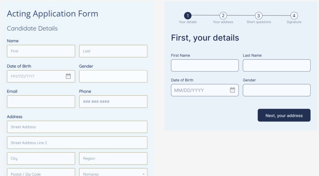
For example, rather than presenting a long form to fill out all at once, we can break it up into smaller, more manageable chunks. We can also use progress bars or indicators to show users how far along they are in the process, which can make it feel like they’re making progress and that the task is shorter than it actually is.
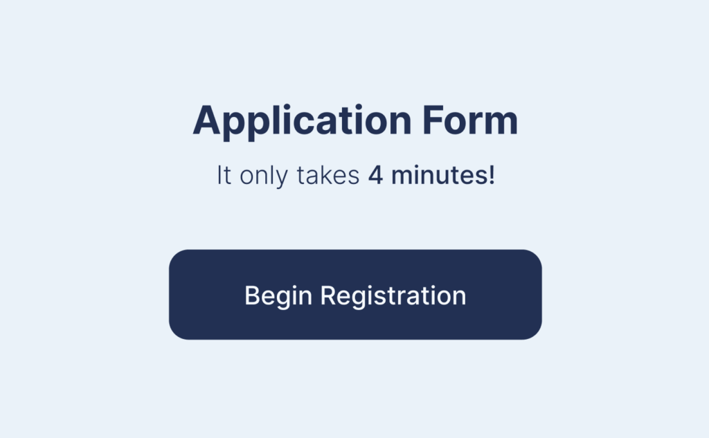
Would you prefer the application form on the left or right?
Don’t Count Clicks
Another related principle to progressive disclosure is the idea of “don’t count clicks.” While the 3-click rule has been popularised as a benchmark for good design, it’s important to remember that it’s not the number of clicks that matter, but the effort required from the user. In fact, some tasks may require more clicks, but if they are designed in a logical and manageable way, users may feel like they are making progress and the task may feel shorter.
This is where the time paradox comes in: a task that requires only 3 clicks may feel like an eternity if it’s confusing and frustrating, while a task that requires 12 clicks may feel like a breeze if it’s intuitive and engaging. As designers, it’s our job to balance the number of clicks with the ease and enjoyment of the user experience, and to remember that more clicks can be better if they are thoughtfully designed.
Keep it Honest
While the time paradox and progressive disclosure can be powerful tools in our design arsenal, it’s important to use them wisely. We don’t want to use them to manipulate or deceive users, but rather to create experiences that are engaging and enjoyable. We should always be transparent and honest with users about what they can expect and how long a task will take. It’s like going on a first date, where you don’t want to pretend to be someone you’re not, or there won’t be a next date.
By keeping the time paradox in mind and using progressive disclosure thoughtfully, we can create experiences that are both enjoyable and efficient. And who knows, maybe time will even fly by a little faster the next time you’re designing! Just don’t blame me if you forget to eat lunch because you’re so engrossed in your work.