From data to design: optimising the navigation menu at Torfs
Torfs is among the biggest footwear retail chains in Belgium. It’s a family-owned company with over 70 stores across the country. While a great customer experience remains important for each of Torfs’ shops, they also strengthened their position as an online retailer. To achieve this, they use a data-driven approach. Based on data, collected from multiple tools and sources, Torfs optimises the designs of their web shop to drive more revenue and create a better online user experience for their customers.
The goal
The focus of the collaboration with Torfs was to gain insights in customer behaviour. This knowledge served as input to improve the designs of certain touch points within the customer journey. Examples of such touch points are the interaction with products on brand pages or the performance of the checkout flow. For this case we take a deeper look at a fundamental of web browsing: the way customers use the (mobile) navigation menu. The goal is to have a clear overview of all product categories, a frictionless way to navigate between them, while maintaining the Torfs look and feel.
What we did
Our approach
Data analysis
Each optimisation starts with data analysis. This input from actual customers serves as the foundation for a more user-friendly design. For the navigation menu, we were looking for answers to the following questions:
- How do Torfs customers use the navigation menu on both desktop and mobile?
- What are the most popular menu items?
- Do customers experience any possible frustrations with the current navigation menu?
By tracking the clicks of each menu item, web analytics provided insights in the number of clicks per item in the navigation menu. This way we could quantify what the most popular items were and what categories received hardly any clicks.
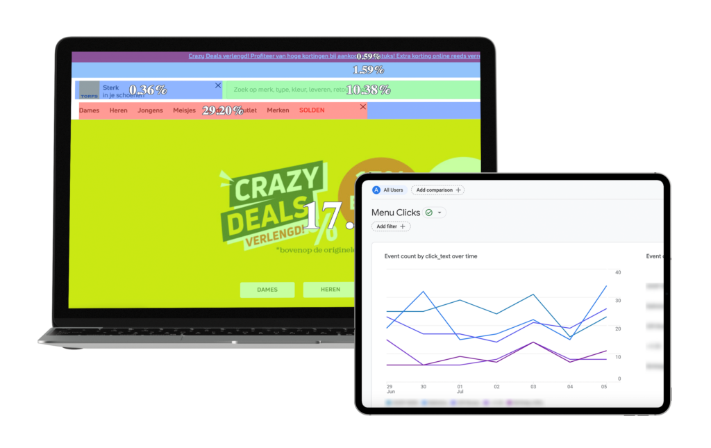
Data analysis on different heatmaps and web analytics.
Behaviour analysis based on UX metrics
With the insights from web analytics in mind, we extended our web analytics research with UX metrics. This way the actual user experience of the current menu could also be measured and analyzed. Starting with heatmaps and session recordings. These makes user behaviour on the menu more visual and allows to see actual interaction. Especially with navigation menus that expand by hovering over items. You can gather insights into what areas are clicked, hovered, and displayed. And more important, which items are rarely displayed or used. Some tools, like ContentSquare, also provided data on revenue generated by the clicks to include in your analysis. Finally, session recordings might lead to answers on why users don’t reach certain navigation levels or items. It’s the Netflix for data analysts.
Competitor analysis
After we collected our own data insights on how customers interact with the navigation menu, it might be valuable to look at our direct competitors. How did they design their navigation structure? Based on UX and CRO principles, what are the positive and negative elements that we should be aware of in our redesigns?
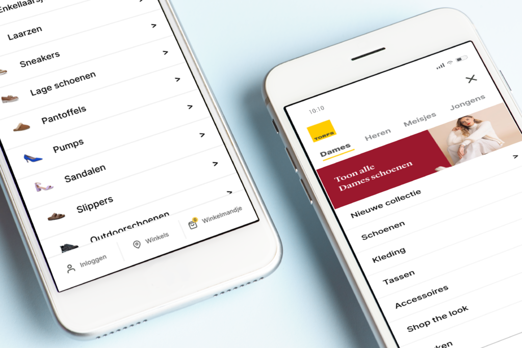
The new mobile navigation menu, with less levels and areas for promoting campaigns.
Wireframing
Final step: piecing all data together and start wireframing the new designs. Based on all insights from data research and analysis, we came up with an optimised navigation menu for both desktop and mobile. Some of the important improvements included less dependency on hovers to reach menu items, creating a better overview of all the different product (sub)categories and having the opportunity to add promotional banners for campaigns within the menu structure.
Specifically for mobile, the amount of navigation levels was reduced from 3 to 2. This saves time for customers to reach the desired product. It also aims to decrease potential drop-off in between navigation levels.
After briefing development with the wireframes, this data-driven approach can be repeated for other touch points of the website for continuous performance monitoring and improvements.
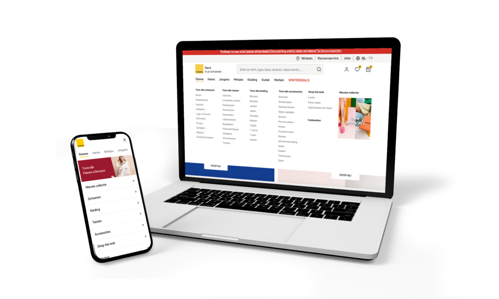
Redesign of both the mobile and desktop version of Torfs’ navigation menu.
The results