Friday the 10th of November: after the success of last year, a new World Usability Day was organised at the Winkelhaak in Antwerp. Not only the interesting workshops drew attention, but also the planned speakers and discussions were still to be explored on this day. My goal for today: gather as much knowledge as possible, and submerge completely into our Belgian UX-word and its supporters.
After considering the different options, it was Clovis Six’s workshop that intrigued me most. Why? That’s a question I’m not really able to answer; but his promise to improve communication within your own team and towards stakeholders was definitely worth listening!
Atomic Design: the theory behind it.
Clovis already believes in Atomic Design…the main question is if we will also become true believers after his plea. But let’s start at the beginning first: Atomic Design. What is it? How do you do it? And what can you gain out of it?
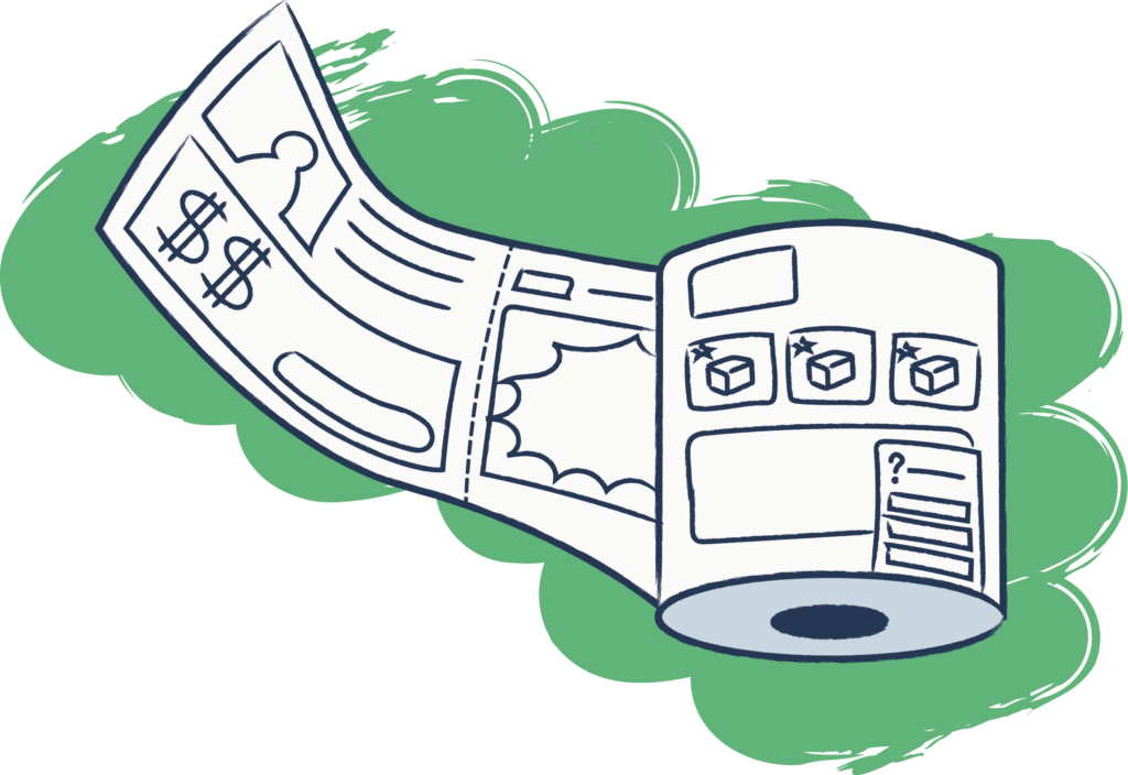
The technique offers a way to divide all information in smaller pieces in staid of offering 1 large ‘blob’ of information to your stakeholders. That way you can structure your information and while doing that, improve communication between the different teams working on the website.
Atoms are the smallest items on your website; they are building blocks like an image or a title. They’re not really useful on themselves but combined they will serve the greater good.
The molecules are a group of atoms, for instance a button with its text.
Now you can start combining the molecules into organisms and templates until you finally end up with a complete page.
In a way, you’ll start very small and build up to a larger whole; think about small Lego-bricks which can be used to build an entire Lego-city.
The underlying goal is to create a shared language. By listing and naming the different elements, discussions can be avoided and everybody in the room at least knows what you’re talking about.
Whether I’m convinced about Atomic Design?
To me it seems like something you always do. You can’t make wireframes without using the different building blocks. Of course it’s true that there is less detail, and the building blocks don’t have names.
This method will at least make you more conscious when it comes to the different elements on the website, and it a lot of cases I can see some positives in that. Also, making a ‘paper’ website can be quite a handy tool depending on your customer or stakeholders. So who knows, I might use this method in the future when it fits the project.
As far as I’m concerned, this workshop was a success so thank you Clovis!
After the lunchbreak it was time for the different speakers of today.
Natalia Arsand was the first in row and immediately came up with an often discussed matter. Sustainable design was the theme; consider your environment was the clear message!
How can a designer help in creating a world where the future of our earth is a number 1 priority (for example reducing meat or recycled boxes)? And how can we, as single persons have an impact on a sustainable future?
Barbara Kok crawled into the skin of the product designers of the world and did research around the different components in a design process and the attached effect on product quality How often is real research done when it comes to the experiences of the end users? And will we get better designs by doing this? A question which wasn’t answered completely, and where much more research is needed to provide an answer.
Finally, Pieter Rahier spoke about UX in the banking world; and how we can improve the customers’ experience through the difficult and slow structure of the banking world. Here we learn that there’s always a way…
In general, World Usability Day has been a nice surprise. It as an interesting day where visions where shared and relations have been made.
I was happy to be here!


