Imagine a vast corporate ocean, teeming with competing company boats fishing for the attention and support of overwhelmed individuals. In between these company boats are smaller boats from Non-Profit Organizations (NPO’s).
While the company boats have already figured out UX as the ultimate solution to attract attention, the NPOs are a bit aimlessly drifting around, often not sure about a good approach.
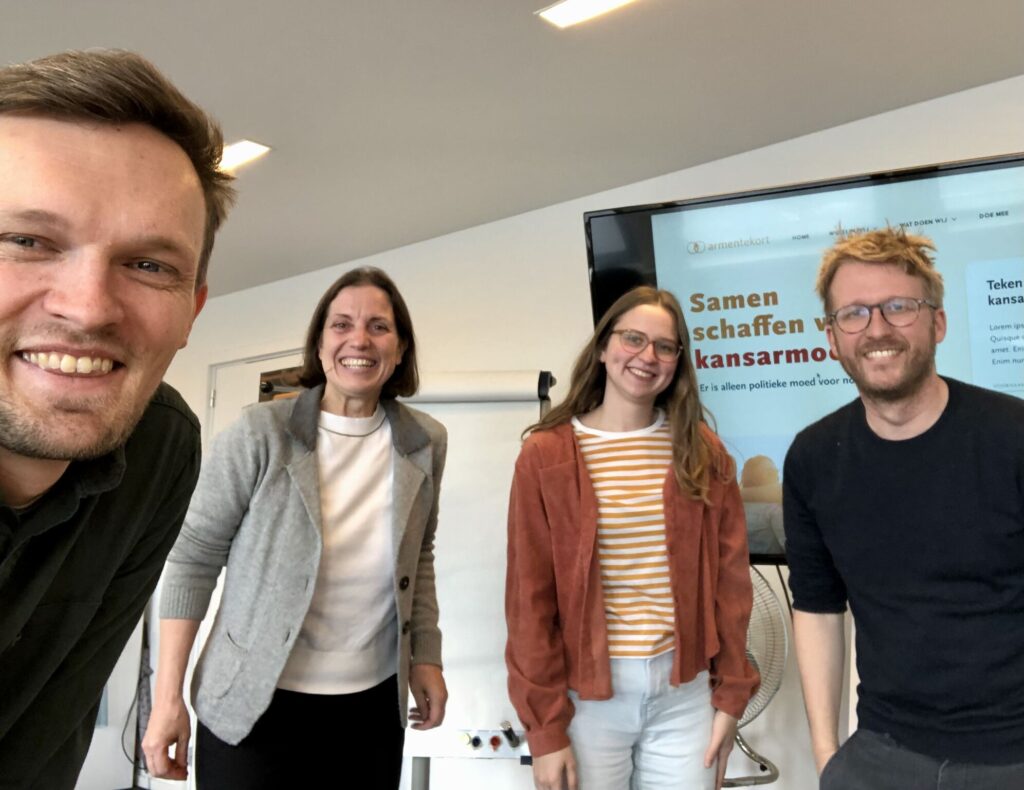
This is a shame really, as a good UX approach would also offer many benefits for NPOs, which are organizations that will always be very needed in our world. Recently we had the opportunity to guide such an NPO. Join us on a sailing trip alongside ArmenTeKort, a Flemish non-profit organization with a singular mission: eliminating poverty. And get ready to discover how non-profits can effectively navigate the ocean to maximize their impact. Diving into UX, wave after wave of advantages surface for NPOs. Let’s look at the three waves we discovered in our project with ArmenTeKort, which are the focus points in a UX process for non-profits. To conclude, we will explain to you why UX can provide a solid boat to sail through these different waves. Ship ahoy!
Wave one: visibility and reliability
The first wave is about visibility and reliability. An NPO should first focus on good content, and next how to structure this content. It should be very clear what the NPO stands for, what they do and how they do it. To support this main message, it can be useful to include research material and specific knowledge. Often, this kind of information is already available in non-profits, as was also the case at ArmenTeKort. The effort for the creation of this content will mostly come from the non-profit itself. But to make sure that an NPO can provide clear and simple content, UX is expected to offer support in this while also overseeing a proper structure.
Wave two: grow engaged visitors
What should follow out of this visibility-and-credibility-wave are more and preferably engaged visitors. These visitors should have a positive impact on the amount of donations, volunteers and partnerships the organization gets. All of this contributes to the non-profit reaching its end goal, in our case ending poverty for good. As UX designers, we could facilitate this process by putting clear call to actions in the right context. Explain to a visitor how they can help and nudge them to select the option that fits their interests and resources most.
To tackle this, we gave ArmenTeKort two suggestions. The first one being a dynamic list of all the ways a person/organization can contribute to the non-profit, adding in filters so the visitor can easily find a perfect match with their resources. A second proposal was to create a flow a visitor can click through, to find a match between the visitor’s profile and resources and the needs of the non-profit. After all, everyone should contribute in the way that suits them best.
Wave three: valuable data
The good thing about all these visitors is that you can gather valuable data around them. For instance, data on the most visited pages and most used search terms. This information can be used to improve the non-profit’s website. Too few click-throughs or registrations for an info session could perhaps mean that the explanation does not convince or encourage visitors enough. On the other hand, data can help an NPO make important choices, decide on strategies, and focus on the right initiatives that are in line with the expectations of the visitors. It is important to attract as many of the right fish as possible using the right bait.
But what about the boat I can hear you thinking? This boat is the place where UX design can really make the difference for non-profits. The most important part about this boat, is a good cooperation between the crew members: the NPO and the UX designers. What you want to achieve together is an agreement on the route you would like to take, how you will reach your destination and what you should do when an unexpected iceberg will emerge. Once you feel like the NPO has the helm firmly in hand, you can let them navigate the ship on their own.
As an NPO, this is exactly what you need to become or stay successful. And in the end, we felt like this solid boat might have been the most important achievement for ArmenTeKort. They now have a steady base that they can use to go back into the ocean and solve the issues that are left. UX is an iterative process, that needs time and effort and after a lot of work, the sailing of the waves will start to feel like a natural process.


