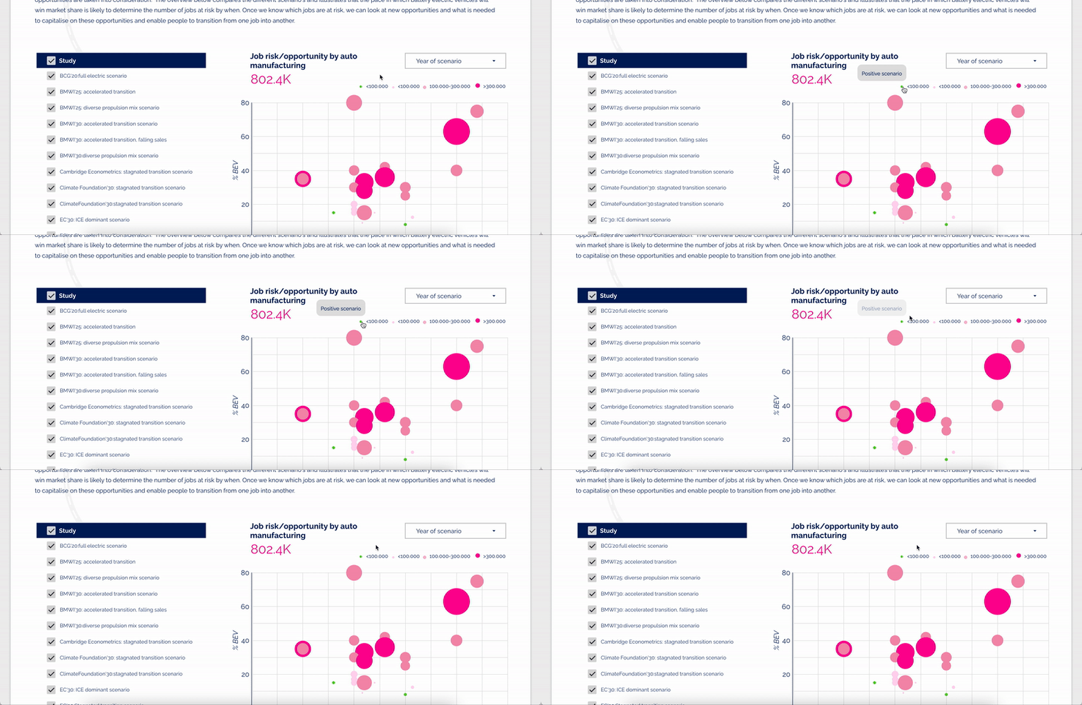
Designing dashboards is an essential part of data analysis and visualization. A dashboard helps users quickly and easily understand large amounts of data by presenting it in a clear and concise way. In a best-case scenario, that is. In practice, a lot of dashboards are just hard to use and not user-friendly at all. Ranging from choosing the wrong graphs to visualize data, to using complex jargon or incorrect colors. If you want to design user-friendly dashboards in an effective way, user experience (UX) should be at its foundation.
These UX design principles will help you create better dashboards
When you think about how dashboards could benefit from UX, the first things that comes to mind is probably its design. A very correct answer. Though, design shouldn’t be the priority on your list. To me, a good dashboard starts with asking good questions.
Get to know your dashboard users
The best user experience puts the user front and center. This is no different with creating a dashboard. Before the beginning of a dashboard project, get to know the users that will be interacting with the tool:
- Who are the users of your dashboard?
- What questions do they want their dashboard to answer for them?
- What’s their level of data knowledge and interpretation?
Depending on the answers to those questions, your dashboard might need to look and behave very differently. Imagine you’re designing a new dashboard for a big sneaker company. Their data analyst might be interested to drill-down into local sales details of a specific pair of shoes and compare between different categories. The marketeer, on the other hand, just wants high-level figures to communicate if they had a good month in terms of sneaker sales. They might not be aware of each other’s domain terminology as well. In this scenario, two separate views may be a solution to avoid frustration for both users.
Next to asking questions, there might be other sources available to gather user insights. Think about user personas or other user research that a company has done previously that can help you determine the best needs for your dashboard. Knowing this at the start might save you a lot of revisions later in the process too.
Key takeaways:
- Before you start designing, get to know your dashboard users.
- Ask questions about the user’s specific dashboard goals, needs and requirements.
- Use personas or other user data that’s already been collected by the company to better match their needs with the dashboard.
Apply UX design principles to dashboards
Even dashboards must obey the law. I’m not talking about speed limits on road traffic (could make up for an interesting dashboard though), but the laws of UX. This is the part where design and psychological principles are incorporated into your dashboard. Let me highlight 4 interesting tips to get you started.
1. Take advantage of familiar design patterns
This first tip stems from Jakob’s Law. Jakob Nielsen (from Norman and Nielsen Group) states that users “will transfer expectations they have built around one familiar product to another that appears similar”. So, what are some of these expectations? And how to apply them to dashboards?
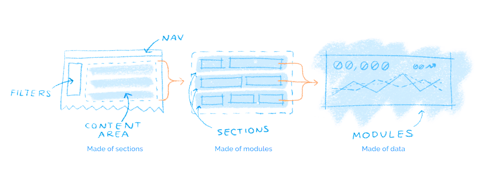
Think about for instance the position of filters. In web design they’re usually placed at the top or left side of the screen. What about the navigation (on the side), or the most important content on a page (above the fold)? Use those already established design best practices to your advantage. Divide your dashboard into content areas and be mindful when you add elements or data to its sections. This way your dashboard will already feel familiar when users interact with it for the first time.
2. Think about proximity
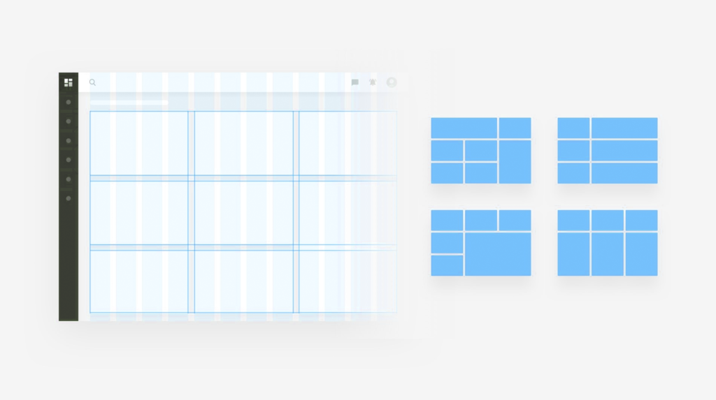
When objects are placed close to each other, our brain groups these objects together. This is especially important with data interpretation. Make sure that the graphs, charts and figures you present next to each other make sense from the story you want to tell with the data.
There are also more ways to use this principle besides moving charts around. Try adding dividers between certain graphs or a different background for a section. Your user’s attention will be thankful. Make sure to not overwhelm the viewer by displaying all your data at once. Rather use sub-pages instead. All these tweaks help our brain to make data interpretation more effortless and relations between data more meaningful.
3. Simplify complex tasks
For some of us, complex tasks feel like a challenge we want to tackle. For most of us, however, complexity feels more like an obstacle we want to get rid of. This also goes for dashboards. Use clear and comprehensive titles for instance. Beware of jargon. Not all dashboard users might know of the subject’s terminology, so don’t let this be the reason they drop off.
Still in need to explain the data? Use a legend, data labels or a tooltip next to your graph. This also makes your graph ‘transferable’. The best data visualizations can be used on any website or platform and still clearly communicate the message to the user.
4. Use as little ink as possible
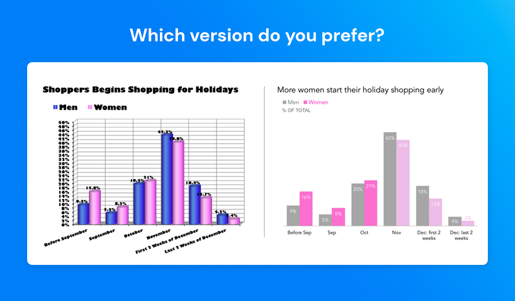
Have you ever heard of the Data-Ink Ratio? It’s a principle introduced by Edward R. Tufte in his book “The Visual Display of Quantitative Information” (highly recommended for every designer). It comes down to using as little ink, or in our case pixels, as possible to communicate the data. Without losing its content or meaning of course. This means no fancy 3D effects, shadows, or unnecessary grid lines. They only add extra clutter to your visual. You can expand this principle as well, towards data labels for instance. Say you have a table column with retail prices of cat food in euros. There’s no need to repeat the currency next to its price in each and every row. Simply add it to the column title, “Cat food price (in euro)”, and you’ve saved yourself some ink. To keep it simple often proved to be most effective when interpreting data.
Keep in mind that saving ink doesn’t mean you have to save on whitespace. Provide your data visualizations some air to breathe. Try to increase the margins between text labels and keep some space above and below your data, so the visual only takes 80% of the available space of the graph. This negative space makes it easier to focus on the data you want to present.
Key takeaways:
- There are many design and psychological principles you can use when creating a dashboard.
- Use already existing web design best practices and leverage those to your dashboard design.
- Be mindful of the position, spacing and relation of the data you put together – separate them if needed.
- Simplify your dashboards as much as possible, without losing meaning, by using clear titles/legends and only as much ink for your data visualizations as needed.
Make your dashboard accessible for every user
Accessibility is often overlooked in relation to data. However, when it comes to interpreting data or interacting with a dashboard, it’s important that everyone can access the information. Some accessibility improvements are actually very easy to implement.
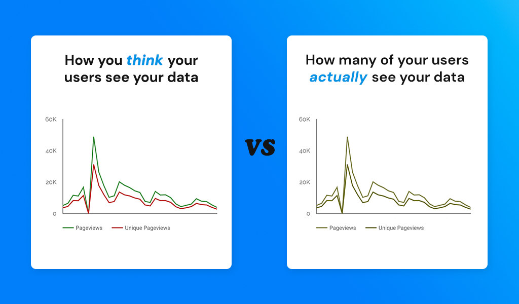
Start by avoiding certain color combinations. Even one of the more obvious ones, red and green, can become problematic for users that have a (common) form of color blindness. Luckily there are other combinations to indicate positive and negative numbers with sufficient contrast. Try a shade of orange instead of red, or a blue color to indicate positive trends. This nifty browser extension can help you test your dashboard’s colors. Your dashboard tool might also allow for other features to make users less dependent on color. Displaying data labels inside the graph, a dashed line next to a straight line, or a subtle pattern for each slice in your pie chart. Minor changes like that can make a major impact for dashboard users with disabilities.
Key takeaways:
- Make sure the data can be read and accessed by all your users, especially when creating a public dashboard.
- Look for color combinations that work even for users with color blindness.
- Apply textures and data labels so you don’t have to rely on color alone for data interpretation.
Just getting started on your dashboard creation journey? You might want to read our blog post about the 4 things I wish I knew before I started working with Google’s Looker Studio. It discusses the best practices to make sure you don’t make the same mistakes I did.

