Trust the process, the design will be there
Double Diamond Panic
“Half of our project budget spent, and we don’t see enough progress, are you sure we’re going to make it?”.
If I got a Euro every time I hear a client say this in projects I would not be a millionaire, but I could certainly buy some tasty cups of coffee. It’s a typical moment of nervousness and panic in every project. It’s not fun to go through, but fortunately we know that in the end everything comes together, results are great, and the clients are happy. And since we are in the optimizing business we started looking for a way to optimize our own project process.
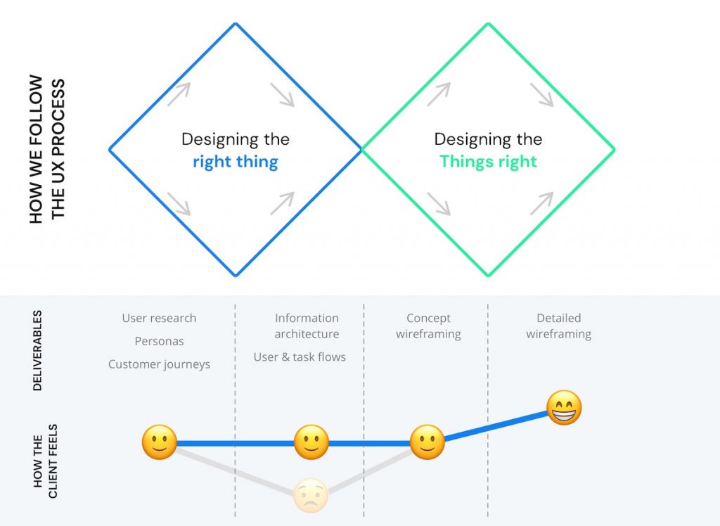
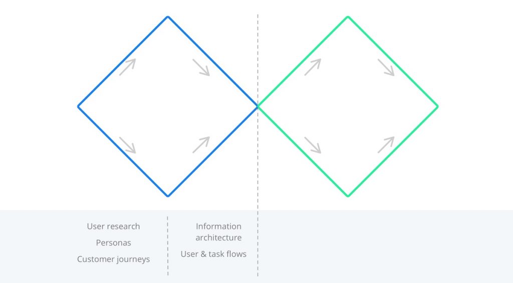
This moment of panic always occurs at the exact same point in the UX Design process: at the end of the first phase of gathering and structuring data and before moving on to the second phase where you start to wireframe. You can clearly indicate this point on the ‘double diamond’ model below.
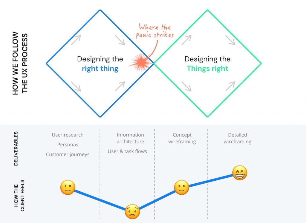
Double Diamond
The double diamond process is a user-centered design process we follow at Humix. It is based on a model from the British Design Council that we adapted for our specific purposes. The process consists of two main steps or diamonds. The first diamond deals with finding out the problem that you are trying to solve, the second diamond with finding a good solution for that problem. Put in another way: the second diamond is about designing things right; the first diamond is about designing the right things. Put more bluntly: you can design a perfectly usable interface or application, but this isn’t worth much if it is not useful and isn’t solving the problem of your user.
Both diamonds consist of two substeps, first divergent, then convergent. In the divergent phase you try to come up with as much information and data as you can, you really try to go wide. What you typically see in the first diamond are activities such as extensive user research, user observations, developing personas and exploring the customer journey.
The second step is convergent: of all the data we have gathered so far, what are the important patterns that arise, what is the essence, what is the real problem here? Typical deliverables in this phase are the information architecture and user flows.
The main problem is that the first diamond is really abstract and theoretical. As we go through the first diamond, we as designers can already imagine how everything we are learning might look like in the interface. Combined with the fact we have gone through this process already many times this means it is easy for us to trust the process. Clients however do not have the same background and experiences and struggle to imagine where this is all heading. The result is that at this point they don’t always get very enthusiastic about the deliverables (I honestly can’t remember the last time a project team went wildly cheering when we presented the finalized information architecture).
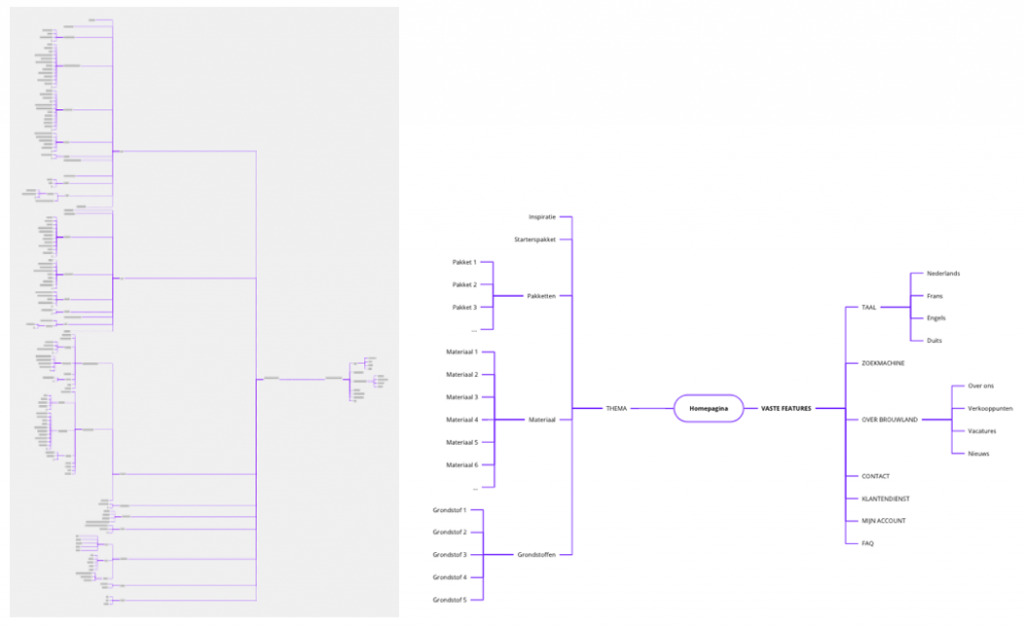
Example of an information architecture of an e-commerce website
On the contrary, instead of enthusiasm we usually see panic: halfway through the project, budget and timing and still no tangible results. It’s now up to us to re-assure the client and explain the project is on schedule and under control. But since this is exactly what a project manager who completely lost control of the project would say, I imagine it’s not always so re-assuring for the client.
Both for us and for the client this is the most difficult step in the project. Fortunately, we have learned that things will start to clear up soon enough. Two things happen:
- We start sketching wireframes and the interface materializes in the client’s eye
- It becomes clear how our design decisions are informed by our efforts up till now
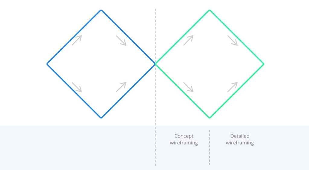
The wireframing part also consists of two steps: conceptual wireframing and detailed wireframing. The first of these steps is again divergent. We sketch out as many ideas as we can on paper. As it is required in the creative process, here it’s all about quantity over quality. But -mind you- we don’t sketch ad random. Every design decision that we make is informed by all we have learned in the previous steps of user research and structuring of information. At this point we usually succeed in impressing clients with both the logic and the variety of possible solutions. During a design workshop we walk the client through the designs and together we make decisions on which of the solutions to continue working with.
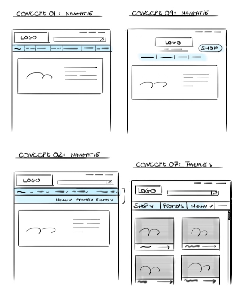
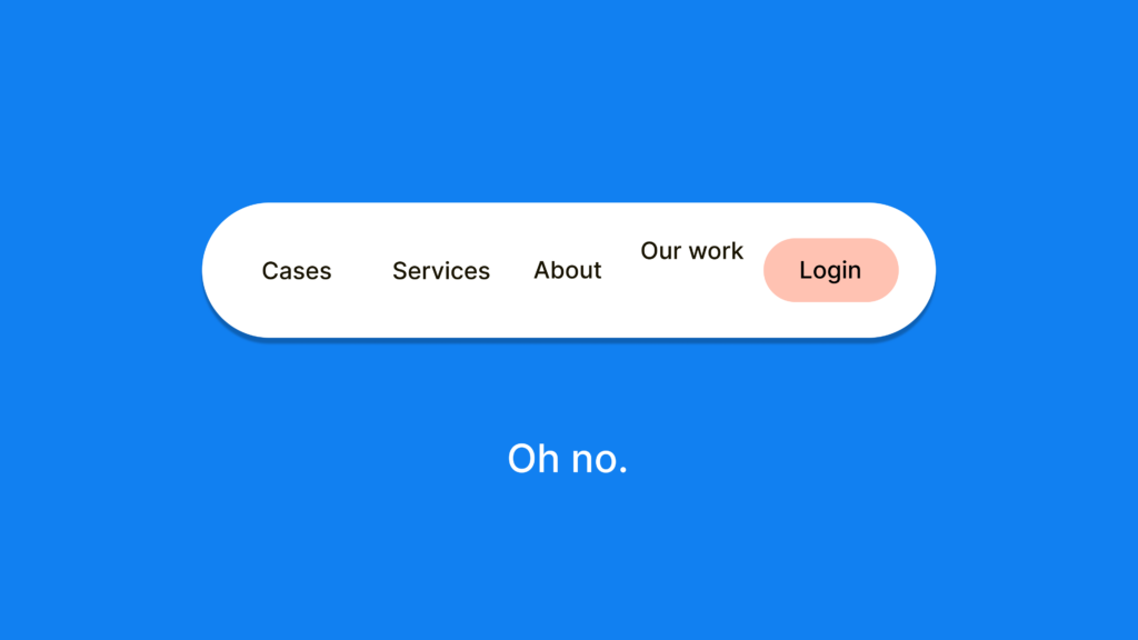
A concept sketch: 4 ways to solve the main navigation in the e-commerce website
Through another divergent phase, the best solution eventually makes it into the detailed wireframes. At this point we move into a real wireframing tool such as Sketch or Axure Pro. In these tools we can make a clickable prototype that we than take to users for a round of user testing. To round of the design process, we move over to detailed mockups, graphical designs and eventually development. But at this point we’re already way past that point of panic.
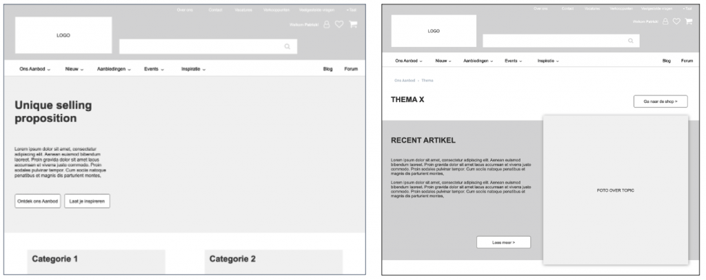
Detailed wireframes for the e-commerce website
So, what do we take away from this? In the first place that some form of nervousness will always be part of the UX Design process. You can’t live on highs all the time. Here we need to realize that we can trust the process. We need to focus on each step in the process and not have our eyes so fixed on the price. Like Ryan Holiday says in his excellent book ‘The Obstacle is The Way’: “We are A-Z thinkers, fretting about A, obsessing about Z, yet forgetting all about B to Y” – Ryan Holiday
Secondly, this doesn’t mean we cannot do better. True to our profession as UX Designers we have the responsibility to continuously improve the experience of our client. We should try to avoid this moment of panic. The best way to do this is to fundamentally restructure the information architecture workshop.
The information architecture shouldn’t be that dry event where we present a tree-structure and ask for feedback. Since the IA does not sink in, clients struggle to give meaningful feedback and to validate the final deliverable.
Instead, we should turn this into a real co-creation event where we already start sketching out first ideas together with the client. This will make it sooner clear how all the previous research morphs into the eventual UI. Since they will have a better grasp of how the IA and the interface are related, they are much more equipped to express their feedback on the IA. The result is a better deliverable that can be supported and validated by the client.
When trying this out we notice the co-creative effort results in a more involved client that is also more motivated. The reason is that feeling of making real progress. For us, it’s motivating: we also have that feeling of progress, but in addition we are contributing to our core business in this profession: improving experiences, everywhere.
