Update October 2022: Google announced that their popular dashboard tool Data Studio will now be rebranded as Looker Studio. Same functionalities, different name. Any mentions of Google Data Studio in this article were also updated to accompany the new Looker name.
4 Things I wish I knew before I started working with Looker Studio
As a conversion specialist, I’ve seen a fair share of data. The good, the bad and, well, the less pretty ones. Regardless of how organized your data is, it’s always (yes, always) valuable to make it insightful. Don’t let data sleep, put it in a dashboard!
I’ve started creating dashboards for clients, from local charitable organizations to European automotive companies, using Looker Studio. Although it allows you to easily connect various data sources into one neat report and offers many many options to visualize numbers and figures, there was definitely a learning curve in order to deliver beautiful reports. That’s why I want to share some insights that elevated my dashboards (and probably yours too) to the next level when working with Looker Studio.
#1 Dashboards are not just for data analysts
Always take your dashboard’s audience into account. Often the great people that build data dashboards, aren’t the ones that actually monitor the data. I know, we love to look at data and unravel its complexities, but unfortunately this isn’t the case for everyone.
If your audience doesn’t have much knowledge or experience using dashboards, make sure your reports are crystal clear. After you’ve got all your charts on screen, take a step back and check if makes sense without any explanation. Sometimes it can be as simple as hiding a metric’s name and replacing it with a custom title that emphasizes the purpose better. It will cost some time and effort, but delivering a bunch of data that people can actually understand at first glance will highly increase the chance of them engaging with the dashboards.
Just because dashboards are about data, doesn’t mean they have to be boring.
#2 Get a designer/UX expert on board
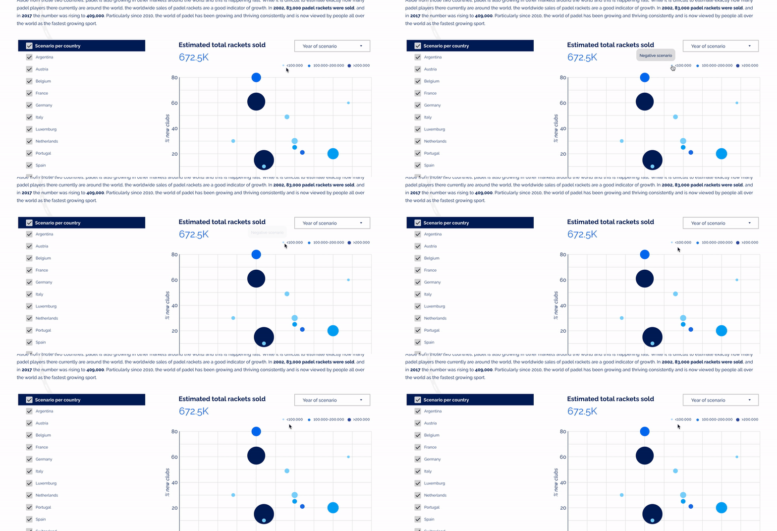
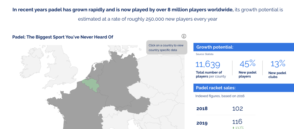
Who said data has to be boring to look at? Having all the correct data in your reports is a priority, but making your dashboards attractive to look at and easy to use is just as important. The tools are there, why not use them? Get together with a design wizard and upload some svg images to accompany your data. It not only helps bringing those plain figures to live but also greatly improves the story you want to tell with your data.
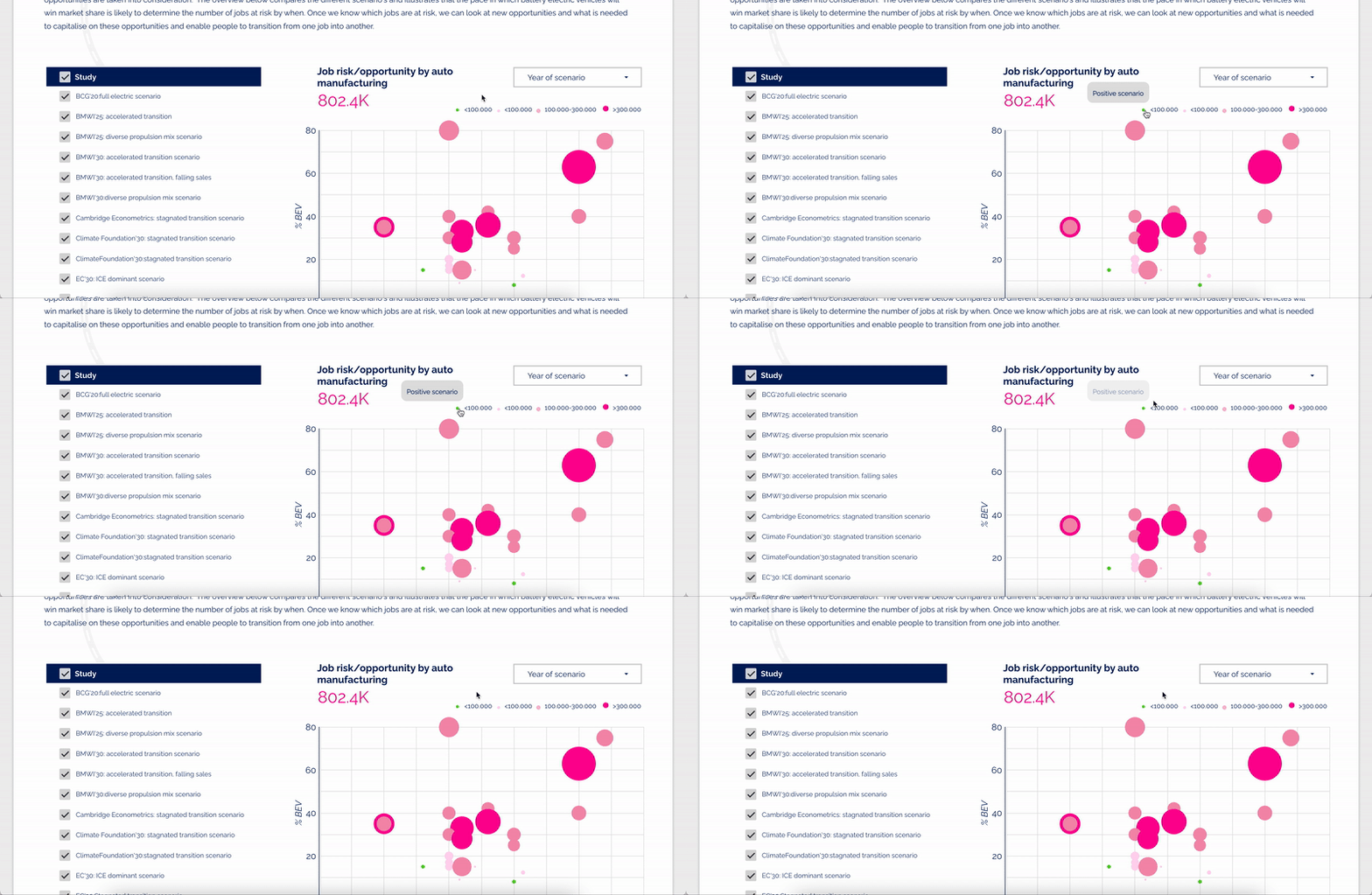
Similarly, involving a UX expert in the early stages will definitely boost the quality of your reports. Especially for those bigger projects where your dashboard will be publicly available for a broad audience to interact with. Make sure they know their way around. Add icons or a custom tooltip (some great ones available as community visualizations) to clarify interactions and guide users through graphs is a simple yet effective way to avoid them from leaving your site because they got a bad user experience.

#3 Embrace Looker Studio’s limitations
With Looker Studio you have a lot of tools at your disposal. And, like with many Google products, you get even more out of it when you get to know all its hacks and tricks. You can create shapes that serve as buttons, build custom tooltips that appear after hover, even generate mock-ups with screenshots of your website inside your dashboard.
My first reaction was to use every single one of these hacks to impress with all of Looker Studio’s capabilities. Boy, was I wrong. Just because you can make something work, doesn’t mean it’s the best solution. For instance, I once mimicked a navigation menu (including dropdown and sub-pages!) to move through the pages of an extensive dashboard. Due to the lack of anchor link support, it only worked well when you clicked the links on top of the page. We advised the client to embed the dashboard onto their website, so we could replace the in-report navigation to actual web page navigation. The results? A cleaner interface and way better dashboard performance.

#4 Optimize your dashboard’s performance
Speaking of performance. Imagine you’ve created an awesome dashboard, including multiple pages and complex data visualizations. As soon as you hand it over to the client, you notice it takes ages to load all the graphs and charts you’ve worked on. Sounds familiar?
That’s why I would recommend to try and feed Looker Studio with data that requires as less calculation inside the dashboard as possible. If you’re using Google Sheets as a data source, think about calculating your final data before entering the numbers into the sheet. This way you keep the performance of the dashboard, plus the happiness of your users, as optimal as possible.


